
When you hear “animation”, what’s the first thing that comes to mind? It could be a scene from one of your favorite movies, a recent YouTube video you watched, or a social media ad that popped up on your feed.
However, as a professional design team will tell you, the countless animations users barely notice are the ones that can have the most impact on their experiences—micro-animations.
Micro-animations and interaction play a major role in UX design today. These small, functional animations around menus, buttons, links, notifications, scrollbars, etc., help make user interfaces more interesting and, more importantly, easier to use.
Why use animation in website design
Expertly integrated into the apps and websites we interact with, micro-animations and interactions can improve navigation, enrich the user experience, and make the entire experience more rewarding.
Read: Grow your business and brand with Chittlesoft’s website design expertise
With animation in website design, you can better engage users and eventually encourage them to respond to your call-to-action.
Wondering where to start? Keep reading to learn when to use animation in website design, as well as when you should avoid it.
When to use animation in website design
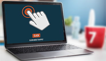
1. Point users towards a specific action with micro-interactions
A great example of what users are looking for in a micro-interaction is Facebook Messenger’s thumbs up/emoji-expanding feature.
As the user holds down the thumbs up, it expands, allowing the user to control the size of the emoji they send. It offers feedback, direct manipulation (a human-computer interaction style), and an instantly visible outcome of their action.
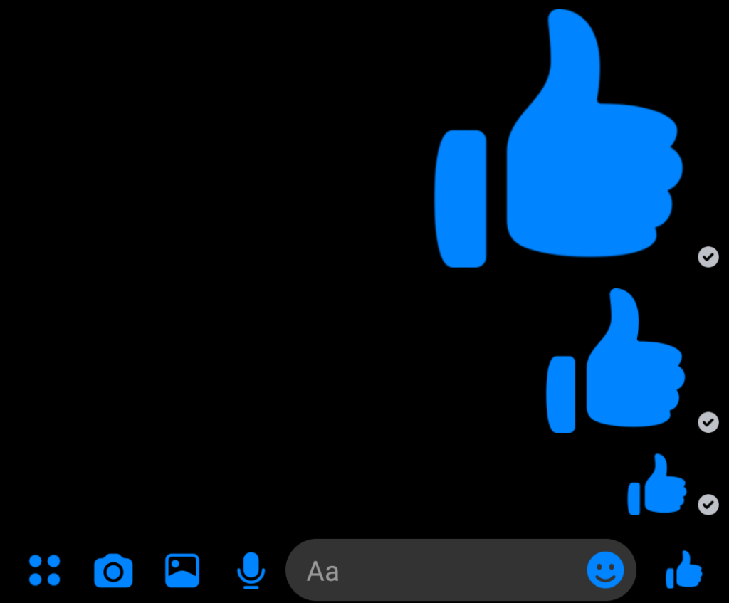
This kind of animation in website design makes interaction with your website more comfortable, directs the user’s attention, and helps create a more rewarding user experience, like so:
2. Reveal more information with mouseover or hover effects
Here, hovering over one spot reveals additional information on the screen. This is a great way to build curiosity while keeping your page uncluttered.
This effect allows users to get more information on what they’re interested in just by hovering over something, such as an image or design element.
When users notice that a design element responds when they hover over them—by changing color or moving, for example—they instantly understand how to interact with your website and find what they’re looking for.
When well-planned and well-designed, animation in website design can make the user experience effortless, delightful, and engaging.
3. Show progress with loading animations
In an ideal world, there would be no waiting around for things to load, and we’d be able to move between pages and screens without any delay.
But, in reality, even with processing getting faster, there are moments where you require your user to wait while an action is completed.
You don’t want your user to abandon ship out of frustration, and that’s when an engaging animation can help—it can keep them entertained while reassuring them that progress is being made.
There may be other places on your website where you anticipate moments of frustration for your users. In those places, animation in website design can have a significant, positive impact on their experience and your results!
4. Draw attention to CTA buttons with Pure CSS animations
Picture it: your users are moving swiftly along the route you planned out for them, with your website design elements cheering them on. You want to draw them towards the finish line: your CTA button.
And no, we’re not suggesting any as loud as neon signs; to point users in the right direction, all you need is some subtle, creative animation in website design to capture their attention (and some new leads!). Pure CSS animation can help you deliver just that.
Pure CSS is a lightweight framework that developers use to create responsive websites and apps. It allows for animations to be quick and sleek, inviting the user to interact with them.
When NOT to use animation in website design
While many web designers see the value in micro-animations and interactions in web design, some are skeptical. They believe that animations can be disruptive.
Remember: The objective here is to create a seamless user experience, so it’s essential to be discerning and include animations that serve that purpose while avoiding those that are distracting.
A few “don’ts” to keep in mind
Avoid animation in website design if it will:
- Make reading text harder. Animated paragraphs, for example, may look eye-catching, but they can be an irritant and make focusing on the message challenging.
- Deter people from completing a task such as filling out a form. Here, animated form fields can demand more effort from the user and make the process tedious.
- Overburden website/app performance. Keep it light, and avoid animations that will slow down or break the flow of the user’s movement through your website or app.
Animation in website design can produce excellent results if planned and executed with expertise. Because we are a full-service design agency, our team is equipped to build or enhance your website or app with a perfect selection of design elements to help you reach your goals.
Ask us how we can increase your visitor engagement across devices!