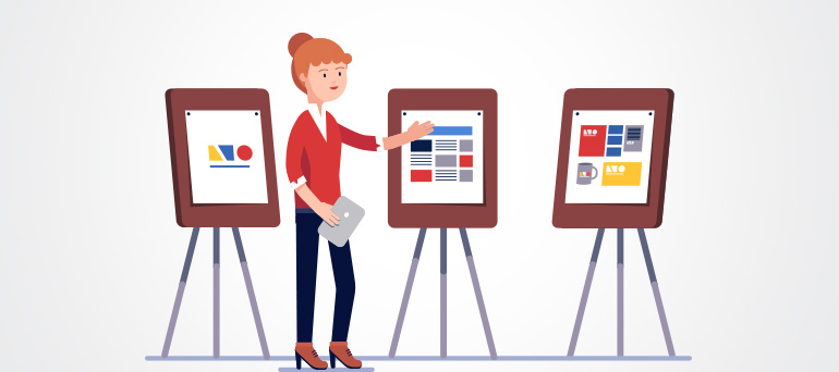
The same design elements can be interpreted differently by different cultures. The appeal of an aesthetic is, therefore, subjective. So, it is important to know your target group, and know what aesthetic suits them. The arrangement of line, shape, color and typography should be done with your target group in mind. Design should help the target group get the information they need to take the action you want them to. It should help them get information, make a purchase, learn more about your company, or establish an emotional connect with your brand. This makes navigation and interaction easy for people. This is why brands that make the same products have contrasting designs that suit the different target groups they cater to.
Read on to learn how to choose an aesthetic that will appeal to your target group.
1. Know what your brand is about
By knowing what your brand is about, and what makes it different from your competitors, you can represent your brand uniquely. It’s important to be able to define your USP. The USP of Vimeo, for example, is that it is a platform to showcase short and long videos of professional videographers. This differentiates it from YouTube, and helped it gain popularity. A clearly defined USP such as this can be showcased using appropriate aesthetics. Colors and design can make people feel a certain way about your brand, and help establish an emotional connect.
2. Know your audience and speak their language
By knowing your audience well – demographic factors, lifestyle, income and culture – you can get a sense of what aesthetic would appeal to them. You can create an audience persona to understand what products they want. You can also find out what size and placement of advertisement suits your target group. For this, beta versions of a product can be tested and data collected. Using UX research, you can find aesthetics and appropriate designs that can be used to market these products. You can then use elements in line with that, incorporating white space strategically. With a solid understanding of your audience, you can provide them with the information they need, and speak their language while doing so.
Competitors (who manufacture the same products) use different branding to appeal to different target groups.
The aesthetic you choose can tell people something about your brand story. Here are a few examples of how competitors in the same industry use different visuals to convey their priorities, differentiate themselves, and connect with their specific desired target group:
1) In the case of India’s taxi industry, competitors emphasize very different aspects.
Ola emphasizes its values of being fuel efficient and environment-friendly. It makes the pool service prominent, and encourages ride-sharing. Its visuals are predominantly green, and include trees and other elements found in nature. Uber, on the other hand, started out by emphasizing luxury. Its images included big cars and men in suits. Its images were black and white. There are men in suits in the pictures that don’t make eye contact. They have been known to come across as unfriendly and cold.
2) In the market of electric cars, there are a variety of target groups to speak to.
Instead of competing with companies like Toyota, Tesla differentiated itself by focusing on quality. It established itself as prioritizing speed and luxury. They use advertisements that showcase these aspects, with pictures of blurred surroundings that draw focus to the car itself. On the other hand, Toyota focused on the affordability and environmental-friendly aspects of electric cars. Their poster was green in color, and captured nature.
3) Airlines highlight different offerings
Bigger airlines such as Delta emphasize the high number of connections to cities that they have, as well as their special offers. They use a lot vertical lines that show strength. They also use shapes with sharp edges in their designs to suggest professionalism. They incorporate a lot of pictures of great views taken while flying. Smaller airlines such as JetBlue focus on people’s comfort during the flight. This includes the leg space and the food served. They use shades of light blue, and circles that gives them an approachable and friendly feel.
4) Super chains that sell food products focus on different consumer priorities
Trader Joe’s is smaller than Whole Foods, and have differentiated themselves in the market by focusing on products that are hard to find – such as exotic foods. They focus on “fun” by using bright colors in their brand. Whole Foods focuses on healthy foods. It charges higher prices, for better quality, organic produce. Their visual branding incorporates a lot of green.
5) Sports companies campaign differently for women as a target audience
Reebok joined Instagram and other digital platforms after Nike but has caught up quickly. The visuals used for Reebok women focus on the work outs and hard work. They have images of muscles, weight lifting, boxing and other such activities. It encourages and challenges people to be push their boundaries with physical training. Nike women has well-made videos and images. There are experiences shared by women in short videos – which include hurdles that they overcame to get to a good level of fitness, that helps people connect to them. They use more outdoor pictures that include nature.
6) Different values are emphasized by firms in the cosmetic industry
Bath & Body Works emphasizes its wide range of products, with various appealing fragrances. It places importance on the wide range of ingredients they use to give their products the perfect smell and texture. It uses colors in pink, orange and green to bring to mind natural ingredients. Lush prides itself on its handmade products that use fewer but important ingredients. It also markets its products as vegan, and not tested on animals. It uses simple visuals such as white letters on black backgrounds, that include keywords such as “vegetarian”, “fighting animal cruelty”, that emphasize their values.
If you’re clear on who you are as a brand, and who your target audience is, you can appeal to your target group by using effective designs. Since the notion of beauty changes from culture to culture, there should be a sense of what people in your region like. This data on your brand and audience can be found using effective UX research. Various companies in a given industry have differentiated themselves using aesthetics that appeal to their target group. They choose designs strategically to do this, such as sharp edged shapes to show professionalism, round shapes to show approachability, the color green to show natural ingredients in their products, or the environmental friendly aspects of their products, and colorful designs to suggest fun.
The aesthetic you choose will determine who responds to you and how. For designs that work and help you build your brand successfully, contact us: https://www.chittlesoft.com/contactus.html
[popup_trigger id=”150″ tag=”button” classes=”button”]Get in touch[/popup_trigger]


