
What makes designing a government website different from designing a corporate one? From a user experience and usability point of view, one big difference is whom it’s created for.
A corporate website does well when it is engaging, on-brand, and easy for a specific audience to use.
A government website, on the other hand, must serve all citizens. This means catering to differences in:
- Tech proficiency
- Age
- Ability
- Language
- Devices
- Education
- Access to the internet
Tip: To create a well-designed government website, offer an inclusive experience for all citizens.
Well-designed government websites meet user expectations. Why?
Simple answer: To build trust.
Government websites are visited by people with varying levels of hands-on experience with the internet, technology, and websites. However, it’s important to keep in mind that many users will expect the seamless experiences they get on corporate/private sector websites.
That kind of user-friendly, intuitive experience feels familiar to many users now. So, offering the same kind of experience can help build trust. And if you want citizens to use the website with confidence, trust is crucial.
Tip: To build trust and encourage citizens to use the website, deliver a strong user experience.
Read: How a well-designed website can boost confidence in your organization
Keeping in mind that limited resources can sometimes be an issue, here are some design tips for creating an effective, user-friendly, well-designed government website:
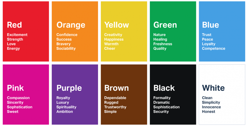
1. Choose a color associated with trust
It’s important for people to feel like their information is safe on your website. There should be an instant feeling of trust when they reach your website, and color plays a big role in establishing that.
A top choice for many businesses is the color blue, which is often used on government websites because it calls up ideas of security and reliability. That’s why we also see a lot of blue in branding within two major industries where trust is a make-or-break factor: finance and healthcare.
Many social media brands—such as Facebook, LinkedIn, and Twitter—use blue to signal that they are trustworthy, which is important because people trust social media platforms with their personal data.
Whether you feature it predominantly or use it strategically and sparingly, blue is an effective color to include for building trust.
2. Keep website navigation minimalistic
On well-designed government websites, navigation is typically very simple. This makes it easy for any visitor to follow. At every point, the user should know:
a. Where they currently are
b. Where they are going
Tip: For easy navigation, make sure to use simple language that a diverse audience will understand easily.
3. Make UX design a priority
The usability of the website—as well as how users interact with it—is very important, especially when you are catering to diverse users.
To create a well-designed government website, choose an agency with the desired expertise in understanding customer requirements and providing effective design solutions.
4. Evaluate your hosting provider’s security features
Citizens expect their data to be secure and the website to be reliable. Ensure your hosting provider can deliver that.
5. Prioritize SEO and keep all information updated
It doesn’t matter how good your website is if people don’t know it’s there. That’s why it’s important to launch a website that uses the right keywords, unique titles and descriptions, image SEO, and other search engine optimization best practices. Regularly updating information will also improve your rankings.
6. Factor in accessibility
As mentioned earlier, inclusivity is key for a well-designed government website. A significant factor is accessibility. Citizens with disabilities should be able to use your website with ease.
For example, voice command functions can give users with visual impairments access to important information and services.
Tip: Validate your HTML to ensure it is being used correctly. This will allow assistive technology to function smoothly and interpret the page content correctly, making it accessible for users.
Additionally, consider people with limited access to the internet or slow internet connections.
7. Choose an agency that can demonstrate trustworthiness
To put the points above into action and create a well-designed government website, work with a competent agency with a history of reliability. Ask to see past work, customer testimonials, and review company policies on transparency. For example, Chittlesoft has a strong commitment to transparency and our customers know their interests are of utmost importance to us.
To build a website that helps you achieve your goals, give us a call today.